Improving the motivation continuum to help people not just quit smoking, but stay smoke-free
Kwit is a holistic evidence-based app that helps people with Cognitive Behavioural Therapy (CBT) techniques to create a healthier lifestyle. It is built on a freemium subscription model, and available worldwide in 16 languages.
Since 2012, it has been helping people achieve one of their most significant challenges: building healthier habits by quitting smoking. And until today, it has been the companion of more than 3M Kwitters.
However, the value perception between both usage models was diluted over time, highly affecting Kwit’s churn rate.
By improving our users’ journey and its motivation continuum to stay smoke-free, we achieved to reduce the churn rate and bring a double-digit increase in the retention of our user premium cohort.
Summary
Led user experience research and design.
Co-led design strategy.
Facilitator on Kwit’s first Design Sprint.
Ikea furniture builder (check image below).
My Role
For this project, I teamed up with all C’ level executives (CEO, CPO, CTO), Head of Marketing, dev’ team and actual Kwit users.
The team
Duration
6 months.
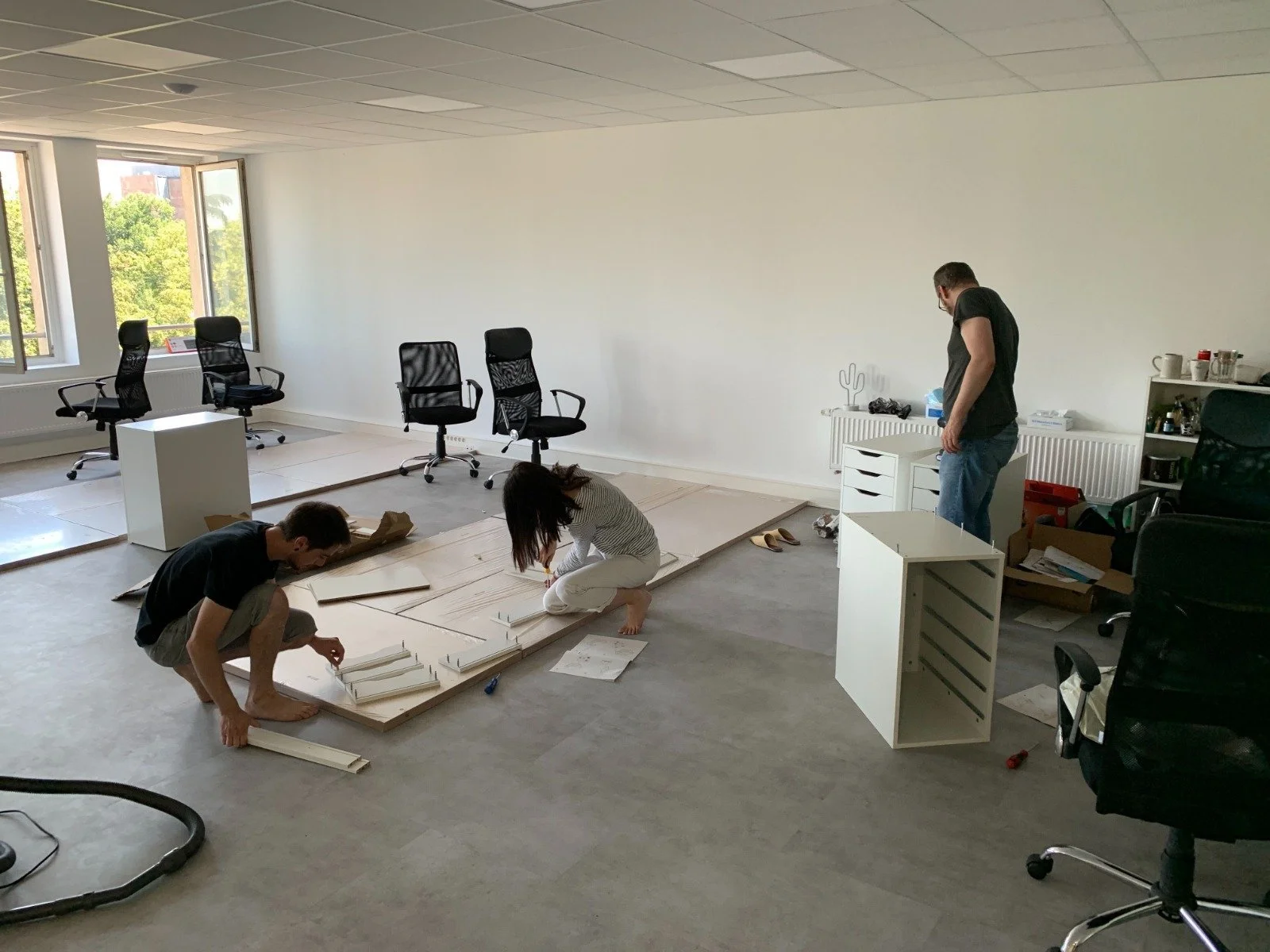
Fun fact was that, as this project began, Kwit was relocating offices. My team and I contributed to build not just the digital future of the company but, literally, the physical one
Setting the path
When I came on board as their first and solo UX Designer, they were levelling up for an exciting phase of growth. However, at that time, the company's UX maturity was somewhere between level 1 and 2.
This meant that even if Kwit understood the potential of traditional research, given its foundation in behavioural therapy principles, continuous user discovery wasn't integrated into the company's decision-making process. And, for example, Kwit's insights into user behaviour relied primarily on quantitative data and user reviews from Apple and Google Stores.
So my mission it was not just about building a product that truly addressed user needs – it was also an opportunity to drive Kwit in a positive transformation.
As exciting as challenging it was, I began to reimagine how we worked, approached problems, and made decisions, all to bring fresh, user-centric perspectives to the forefront.
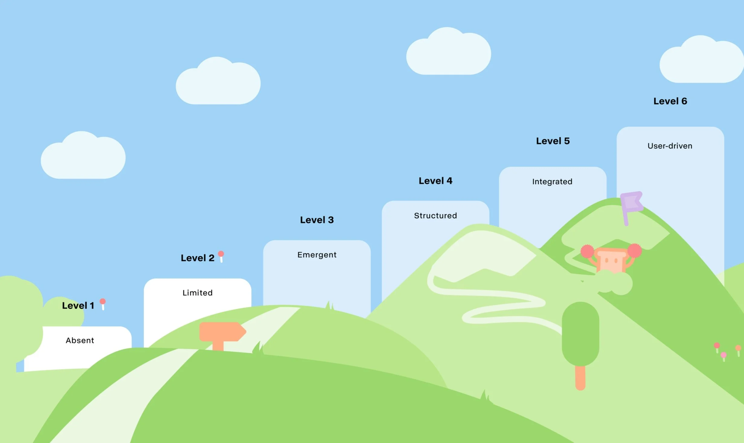
When I joined Kwit, their UX maturity level was in between levels 1 and 2
My role as a Founding Designer
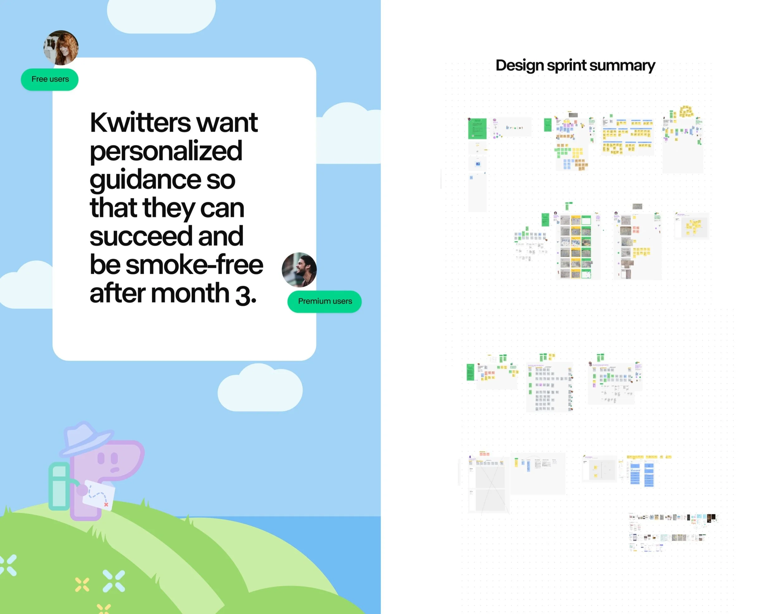
Hands-on deck, my role was to design and execute a working roadmap that would allow Kwit to give finally to our users a seat on the table, focusing primarily on creating a space of active listening and interaction with Kwit’s users, to understand how to help them better to achieve their ultimate goal and stay smoke-free.
Starting with methods like user interviews, ethnographic research, and end-to-end design, I spent several weeks understanding Kwit users and gathering insights that could serve as a foundation towards the next steps that Kwit should lead in order to improve its user’s quitting journey.
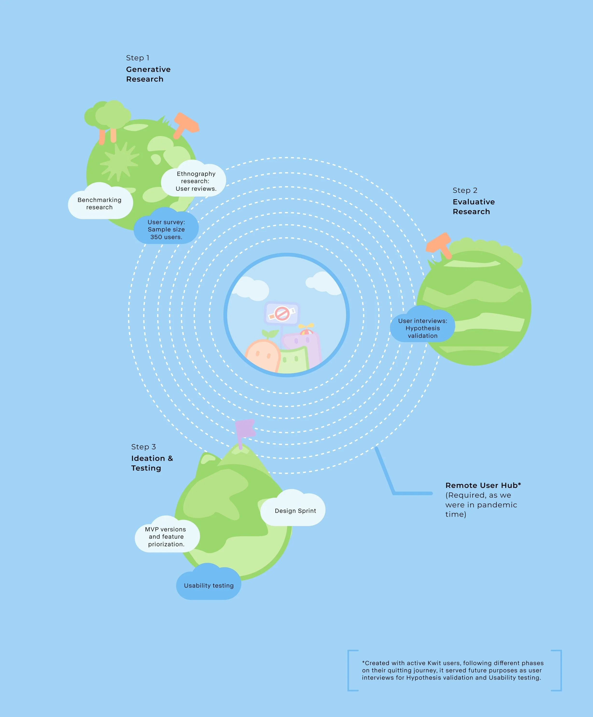
These steps were the foundation of Kwit future projects, adapted to each one considering needs/ timing constraints
Know your users people
Think about any time in your life when you wanted to quit a habit. Now imagine that the habit in question is a harmful one. It doesn't sound easy, right? Along the journey to quit and cultivate new habits, behavioural theory tells us that motivation and consistency are defined as the key pillars to achieving that goal.
Hennessy and Amabile (2010) suggested that rewards can enhance intrinsic motivation and creativity when they provide useful information in a supportive way, when they confirm competence, or when they enable people to do something that they were already intrinsically motivated to do.
Because of this, I invested several weeks in exploring this motivation spectrum and gaining insights into the challenges and priorities faced by our Kwitters. Three patterns came up strongly in our survey*:
*Survey sample: 350 people total; French and English speaking markets
Houston, we have a problem
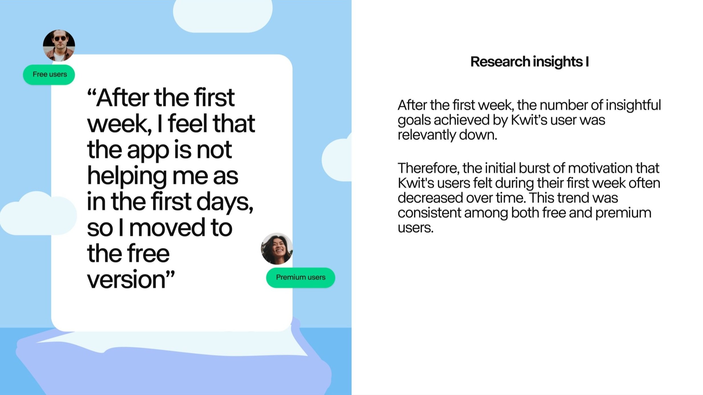
During the first and, especially, the second semester of that year, Kwit experienced a shift in growth dynamics, transitioning from stability to a high churn rate. Retention, particularly among premium users, took a hit. After cross-checking the recent qualitative insights with the quantitative data, we realised that a significant drop emerged from week 1 to week 4, and while retention continued to decline, it did so at a slower rate.
Further analysis of the subscription funnel revealed that some premium users who cancelled their subscriptions opted to remain on Kwit but switched to the free version.
Data collected from previous generative research helped to revisit earlier hypotheses and establish a new round of research. This time qualitative interviews were set in order to understand the underlying problem that made users leave or downgrade their membership.
Out of all the people interviewed, a striking common pattern emerged: the value perception between the premium and free versions was diluted, and the aspects meant to be an upgrade through subscription were no longer relevant.
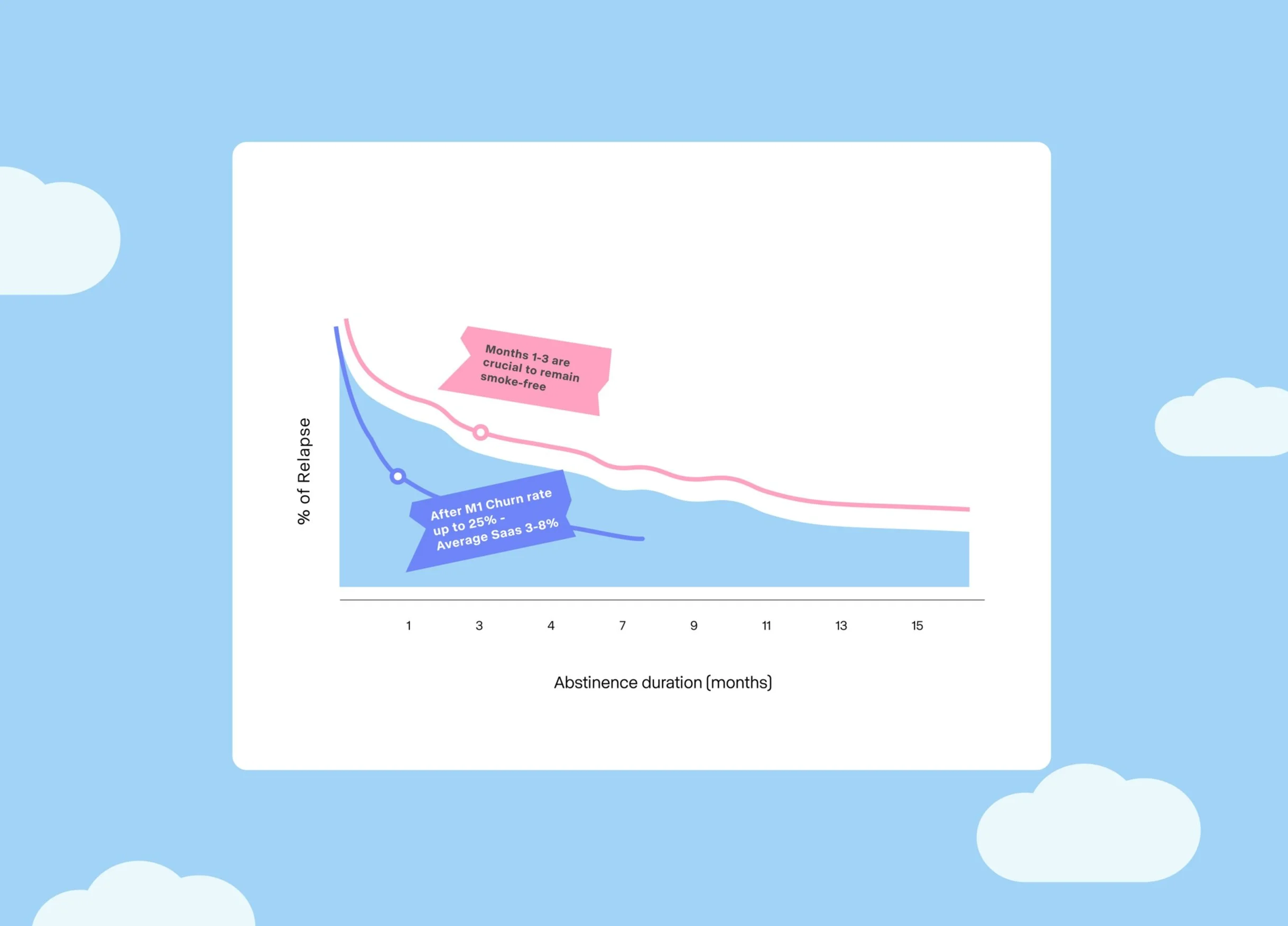
Churn rate data collected from Revenue Cat
Taking action
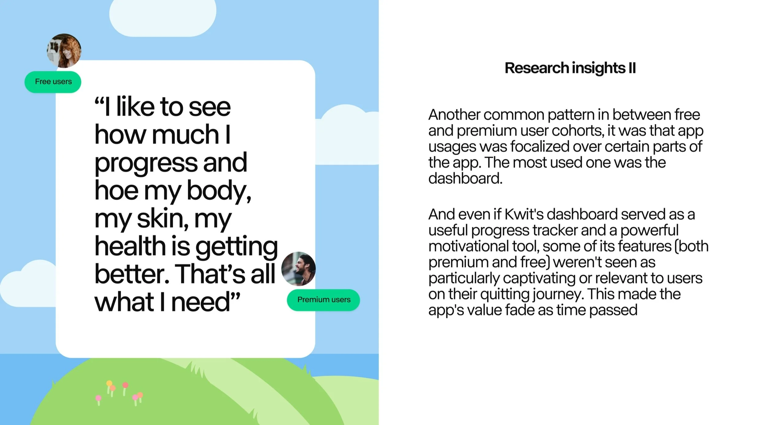
In general, users just want our product to solve a specific problem well, rather than trying to do everything - as a swiss-knife could do. But sometimes, we as Product teams get so excited about adding newness that we forget to make the core experience even better. As data pinpointed, Kwit lost sight of this, especially with its most important feature, the dashboard, which influenced whether users stayed or left.
So in order to act as fast as possible, I decided to organise Kwit's first-ever design sprint. It was created in a hybrid mode as, during the pandemic time, some colleagues were working fully remotely.
In the first week, we created and tested a prototype, and in the second week, we polished it up. Having a working prototype that could serve us as the starting point for solving Kwit's actual churn rate issue was already a huge achievement for the team.
On top, this also helped us to figure out what to develop and plan future projects for the company in the upcoming weeks. We were thrilled about the exciting times ahead, knowing that we had the opportunity to make a meaningful impact on people's lives as they worked towards quitting smoking.
Problem statement and summary of all different steps done in the DS Sprint where we followed a hybrid format
When magic happens
Choosing what to prioritize and release in the past was challenging because there wasn't a clear indication of what would truly benefit our users.
However, thanks to the earlier research and the design sprint, our decisions for the upcoming product release, specifically the Dashboard revamp, were grounded in solid insights and aimed at addressing specific issues that Kwit users were facing.
And after this release saw the light, we measured the impact into 2 different waves during the first months. Data showed us a double-digit increase in retention on our actual premium cohort. It caused a domino effect where subscriptions to premium after the free trial were also increased.
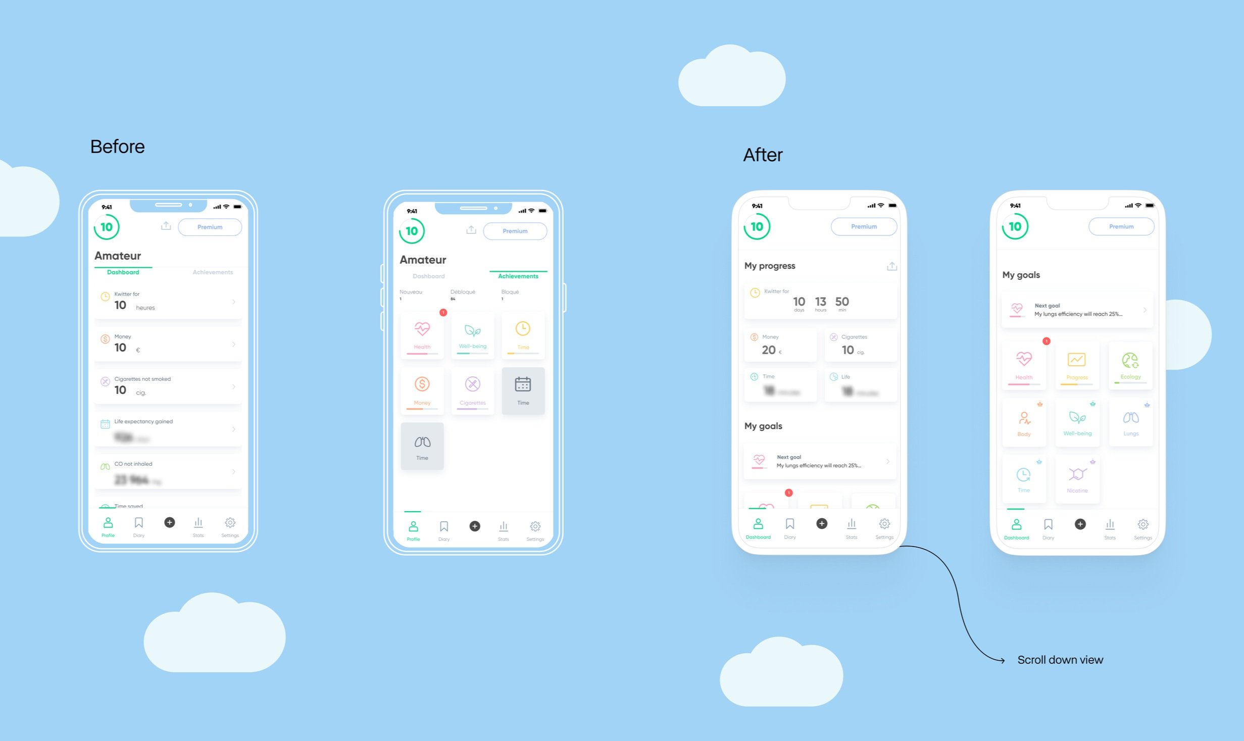
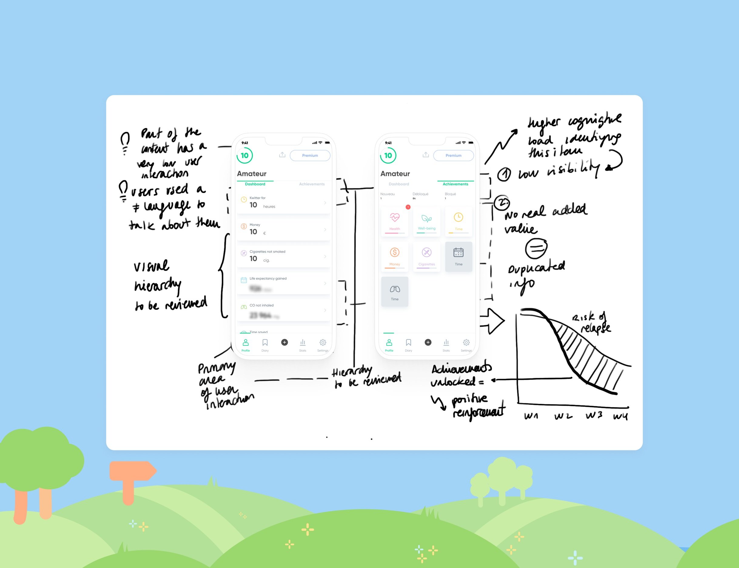
1/5 Old Profile Dashboard evaluation
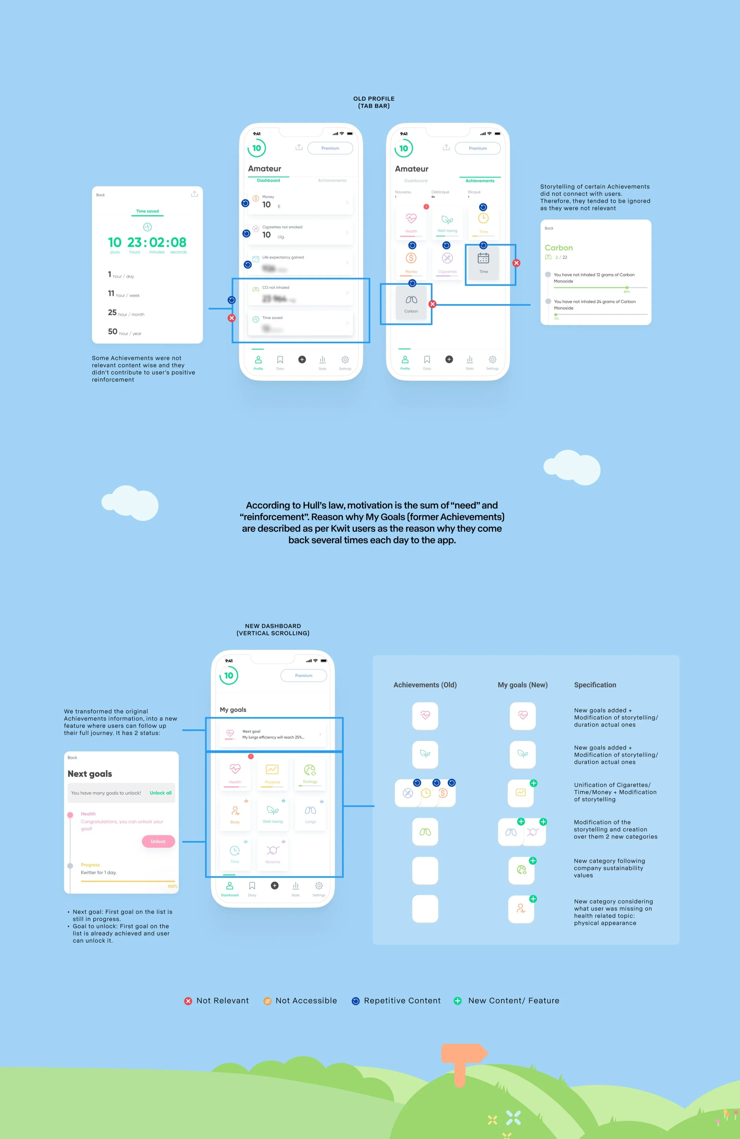
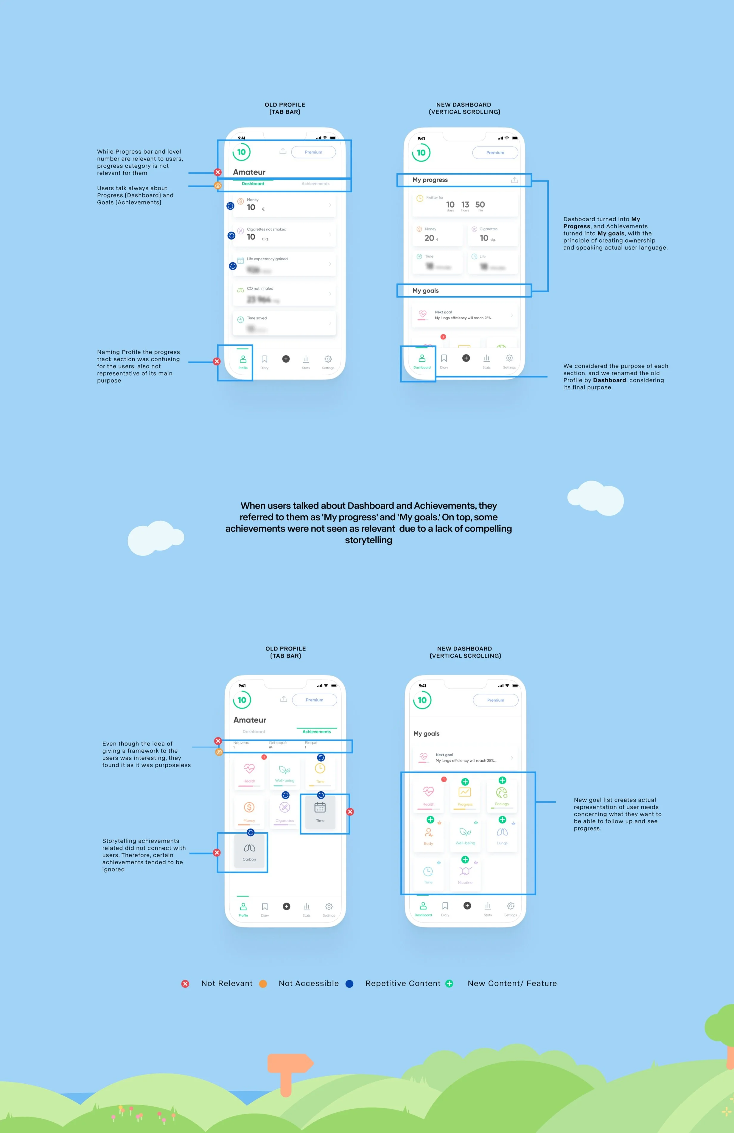
The former Profile (further renamed as the Dashboard) had two distinct sections separated by a tab bar, which had limited/stretch accessibility. Our users found Achievements (later called My Goals) to be lacking in relevance in some cases and insufficient over time.
The content was also repetitive, and the visual design didn't provide an optimal viewing experience. The Dashboard's potential as a tracking and motivational tool was not developed to its full potential, and this had an impact on Kwit users, especially those in the premium cohort.
When I joined Kwit, their UX maturity level was in between levels 1 and 2
2/5 Refining IA and enhancing content relatability
The former Information Architecture (IA) prioritized one of Kwit Dashboard's main content sections (Progress) over the other (Goals). Our collected data indicated that both categories were deemed essential by Kwit users.
However, the previous tab bar limited accessibility to one of these sections, resulting in increased cognitive load, more steps, and longer navigation times. To address this issue, we replaced the previous screen navigation with a more user-friendly vertical scrolling approach.
Additionally, we streamlined the "My Progress" section by reducing the number of categories from 6 to 5. Furthermore, we made structural adjustments to the "My Goals" category, which will be discussed in more detail below.
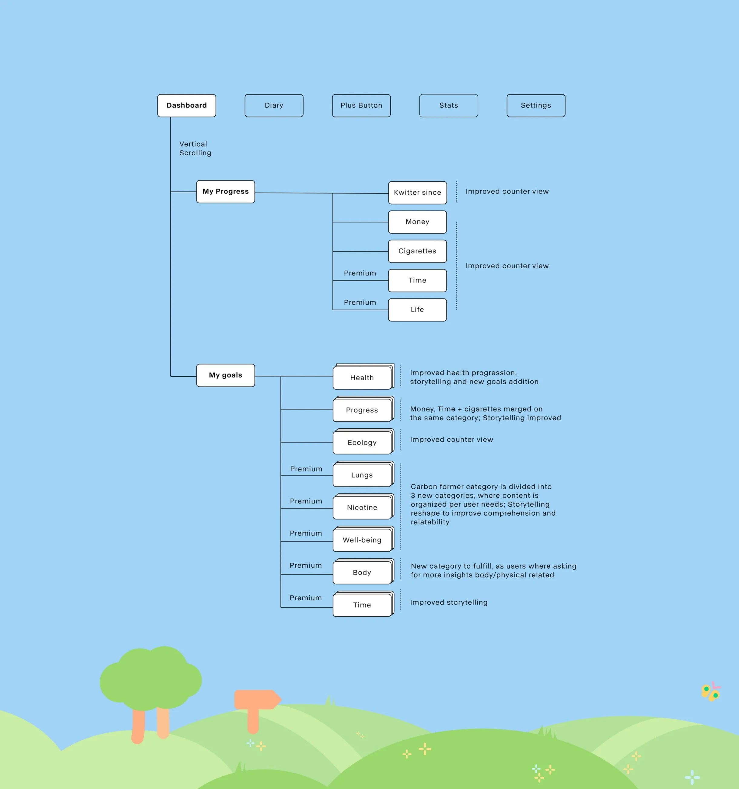
Information Architecture with Kwit’s new Dashboard
3/5 Gamification layer or improving motivation continuum
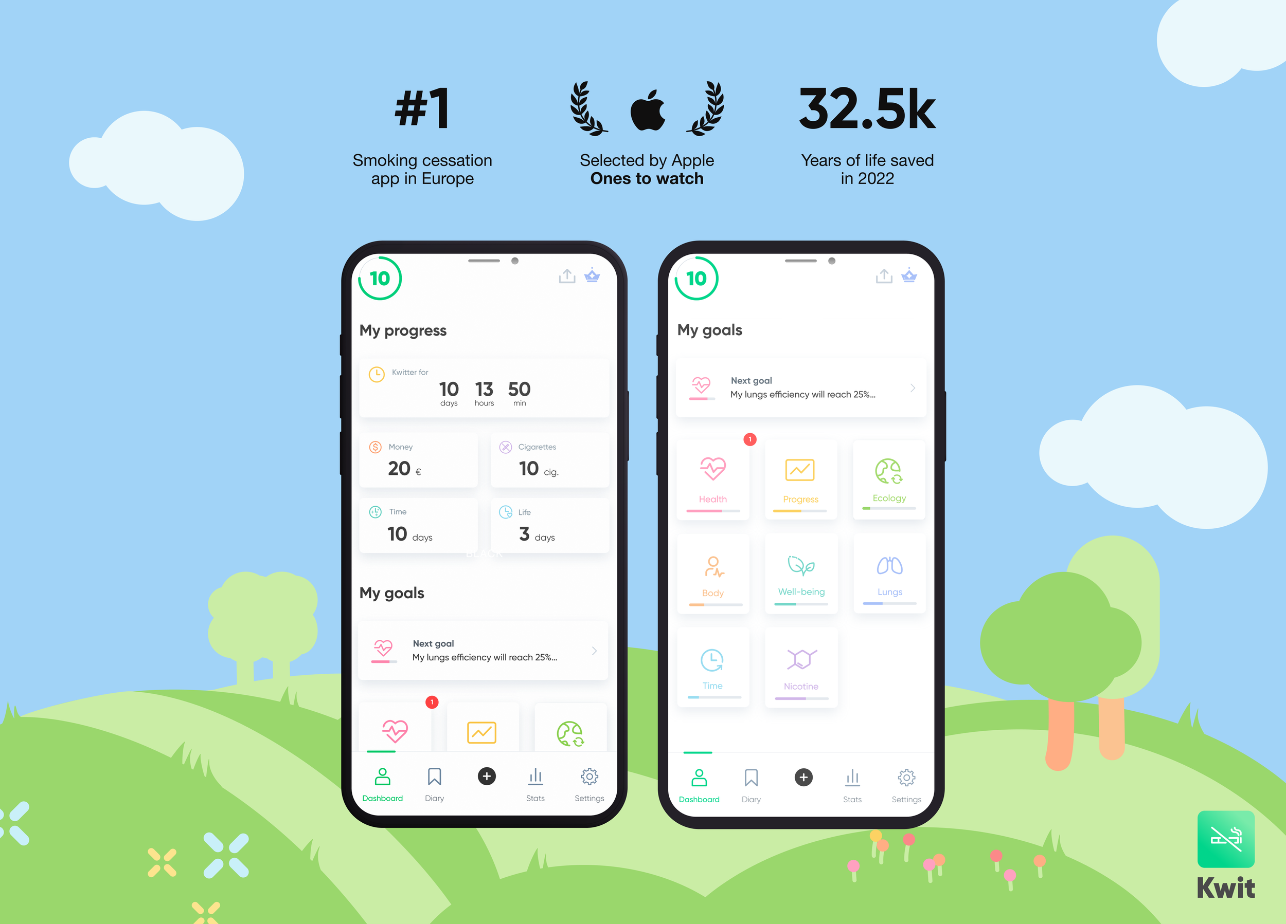
When users shared their experiences on their journey to quitting smoking, they consistently highlighted the significance of the goals they achieved as a powerful source of motivation. This reassured them of the value and worthiness of continuing on their smoke-free path. All these goals were part of what we called at Kwit, the gamification layer.
Hennessy and Amabile (2010) suggested that rewards can enhance intrinsic motivation when they provide useful information in a supportive way, when they confirm competence, or when they enable people to do something that they were already intrinsically motivated to do.
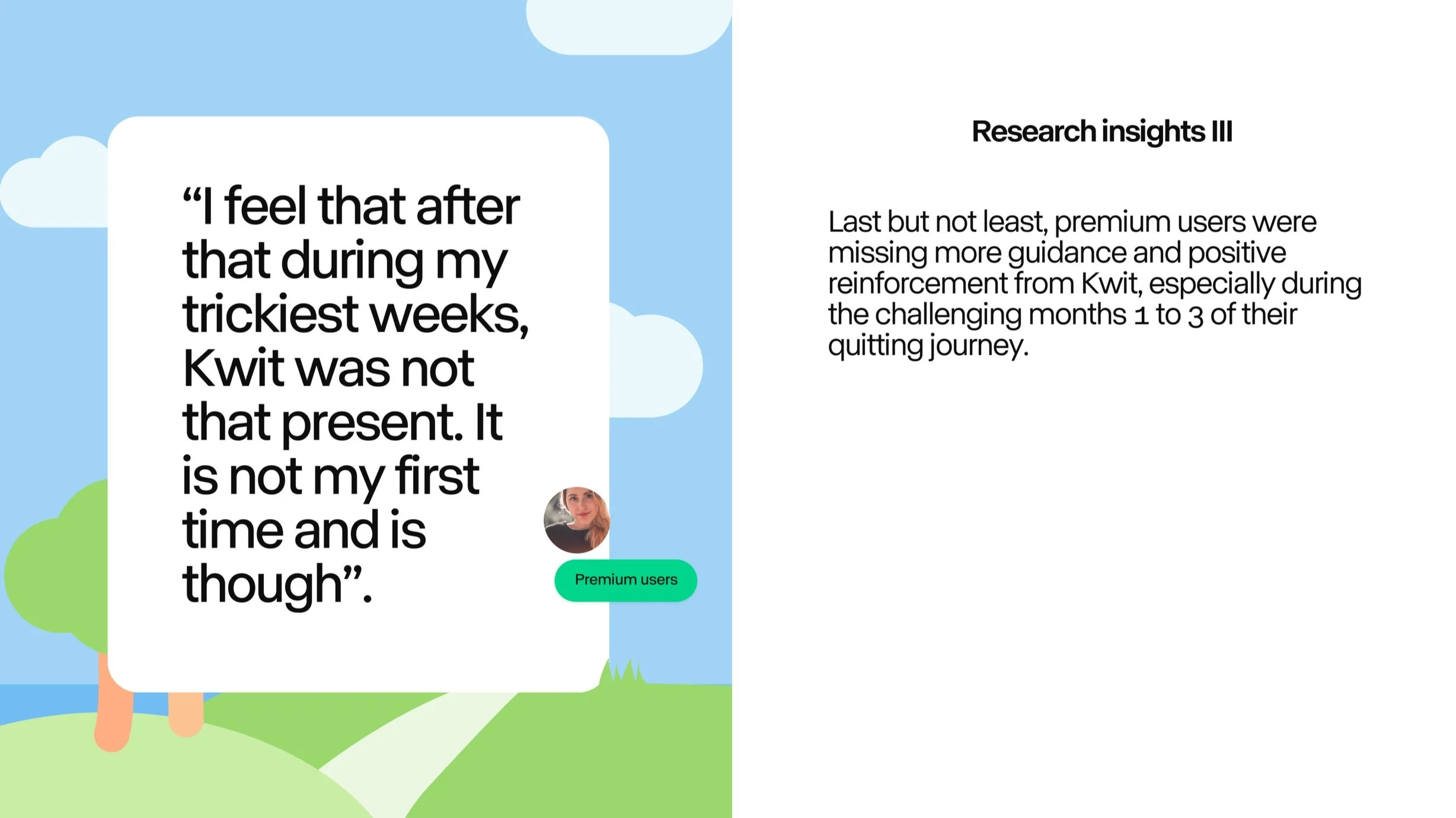
However, beyond the first week, the quantity/quality of available goals provided by Kwit proved to be insufficient, resulting in a decline in the sense of progress, and reducing the sense of competence and, therefore, intrinsic motivation.
To address this issue, we made the decision to reshape the existing categories, enhancing their storytelling, increasing the number of goals within each category, and refining their progression over time. In addition, we introduced four new goal categories that held special importance for Kwitters users throughout their journey: Body, lungs and nicotine.
Final outcome of new goals categories over Kwit’s Dashboard
4/5 Writing with (Kwitters) flavour
Words hold immense power, and how they are used can foster a deeper sense of connection. This principle was our primary focus when we noticed that Kwit users were referring to certain elements in the app differently than the UX writing employed. "Level achieved" didn't resonate as relevant; "Dashboard" was commonly interpreted as "My Progress," and "Achievements" were associated with "My Goals," as if they were aspirations yet to be fulfilled.
This same issue extended to some goal categories that either went unmentioned or featured content that lacked relatability (such as the former Carbon category).
Consequently, we conducted a comprehensive review of the existing content, introducing meaningful categories that could facilitate the quitting journey for Kwit's users and provide a relatable source of motivation.
UX writing improvements guided by actual Kwit’s users
5/5 Reducing friction and cognitive load
Facilitating the identification of key elements and ensuring a smooth user experience are essential for encouraging users to utilize and maintain their engagement with specific features. Success hinges on how these elements are presented, the level of user comprehension, and accessibility.
In the context of the goals section, its visibility was not as prominent, and accessibility was constrained. Consequently, we opted for a transition to a vertical scrolling format and IA restructure. This adjustment places it directly in front of Kwit users, reducing the need for excessive effort, minimizing the number of taps required, and alleviating cognitive load, regardless of the type of phone or screen size used.
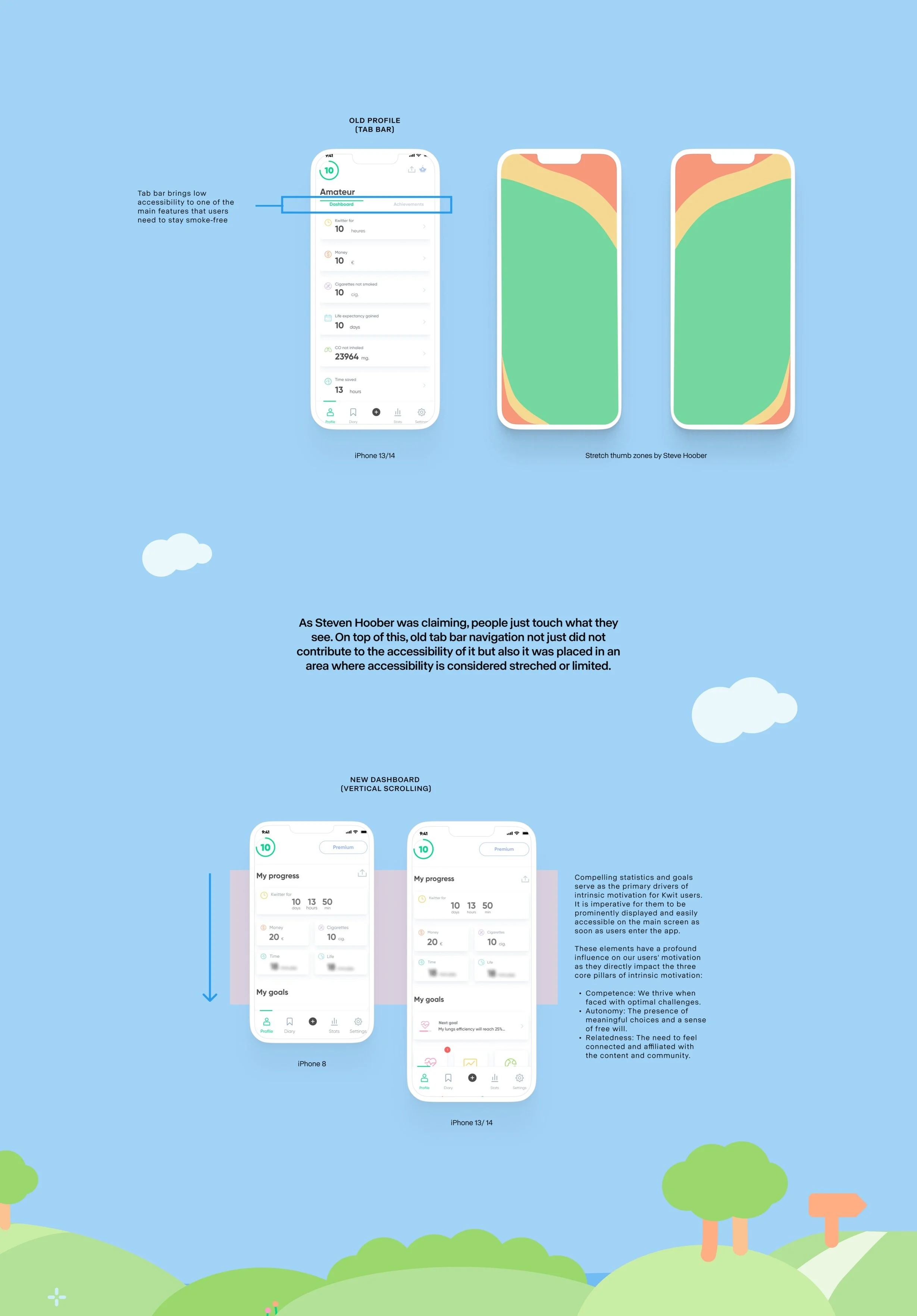
Adding vertical scrolling, accessibility improved towards the second most visited feature: My goals
Final thoughts and learnings
Just as in any new life chapter, this project presented a mix of challenges and opportunities for all Kwit team members, including myself.
As the first and solo UX Designer on the team, my primary objective was to gain insight into how the app was facilitating smoking cessation, supporting users in remaining smoke-free and finding ways to enhance our approach and increase the number of successful non-smokers, particularly during the critical first three months.
To this day, this project remains one of my proudest accomplishments. The primary reasons for this are:
Discover what being a UX Designer really means: Beyond adopting new methodologies, being detail-oriented to design specifications, and smooth handovers to the development team, embarking on my journey in Product Design as the first and solo designer required breaking old habits. It demanded becoming the advocate for the very people who serve as the driving force behind our work: our users.
The role of UX Design as a bridge maker: UX designers serve as architects of these bridges, crafting experiences that transcend the gap between user needs and business goals. This bridge-building role is not just about aesthetics but, more importantly, about functionality and human-centred solutions, enabling users to navigate the digital landscape with ease and satisfaction.
Enhancing core experience over novelty can be the key to success: In the fast-paced world of product development, prioritizing the constant enhancement of the core user experience, rather than chasing novelty, is a fundamental strategy for achieving long-term success. By focusing on understanding and refining the essential elements users rely on, businesses can build trust, foster enduring loyalty, and thrive in a competitive marketplace, laying a strong foundation for future growth and innovation.
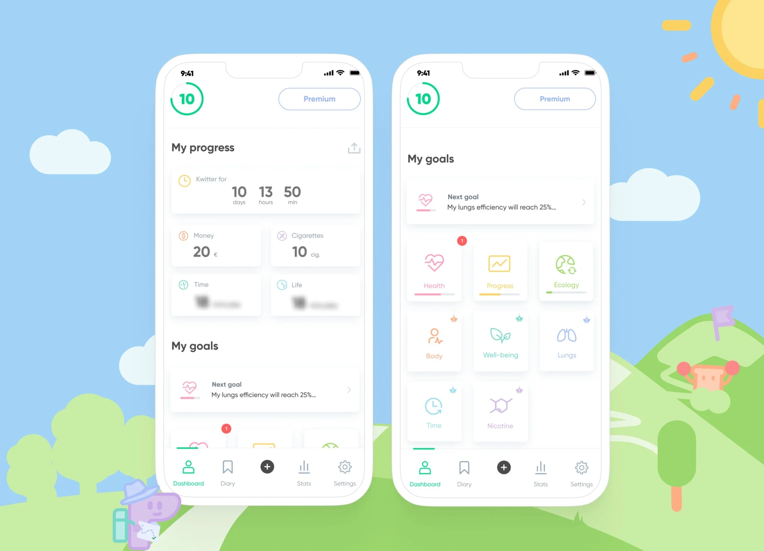
Final version of Kwit’s new Dashboard (free version)
Explore more work
Project
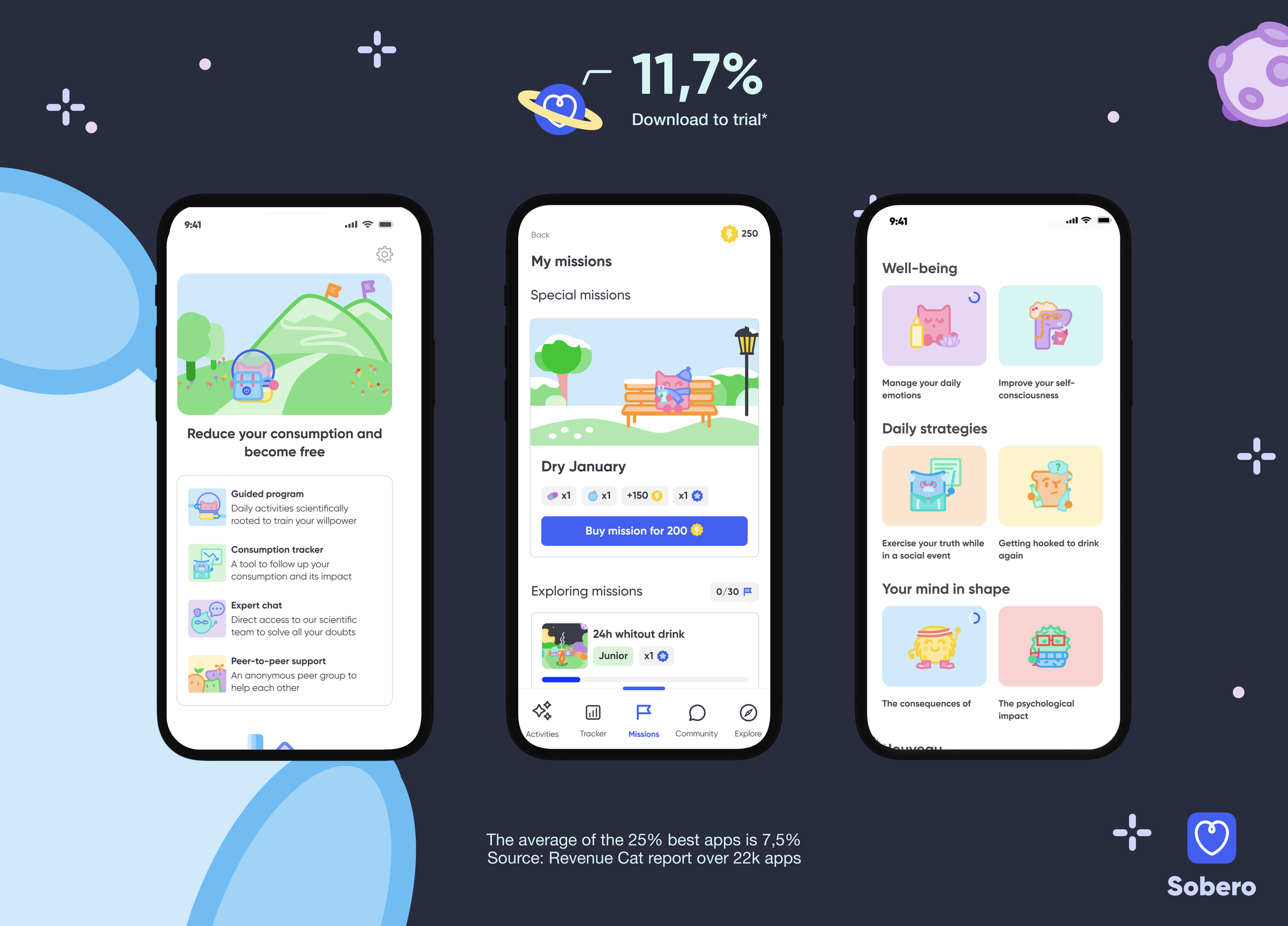
Developing a 0-1 product to help people who want to reduce, stop or control their alcohol consumption
Company
Sobero

Project
Helping families to foster a love for reading in their children
Company
IDEO
Coming soon